Why do I start from Matplotlib and data visualization? Well, maybe because my first academic degree is in Geodesy and Cartography, so visualized data tells me much more than just raw statistics, or maybe because this is just an easy starting point…
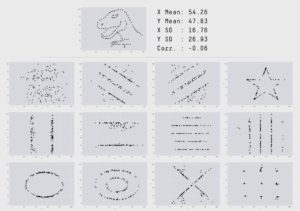
Anyway, It should be enough to just take a look at Anscombe’s Quartet (created by Francis Anscombe’a) or Datasaurus (created by Alberto Cairo) data sets, to clearly understand why statistical inference based just on tabular data might be misleading.
 https://www.autodeskresearch.com/publications/samestats
Now, a few words on this post content. Visualization this is a book-size topic, so first of all I had to pick one language and one library\module. As python is my primary scripting language, there could be only one choice : “Matplotlib”. Second thing is, that it won’t be a comprehensive post like ” from beginner to expert..” but rather a cheat sheet style post . If you want to know more about Matplotlib, then your best source of truth should be https://matplotlib.org/.
Alright, let’s get our hands dirty. For this post, I will use European Median equivalised net income (MENI) data set available on Eurostat home page.
Below code is just an extract from larger project code, which you can find here: https://github.com/kmakiel/Matplotlib_basics/blob/master/Matplotlib_basics.ipyn
1. Required python modules loading, turning off warning messages, switching to seaborn style, setting the backend of matplotlib to the ‘inline’ backend.
import pandas as pd
import numpy as np
import matplotlib.pyplot as plt
import seaborn as sns
import warnings
from scipy.interpolate import UnivariateSpline
from sklearn.metrics import r2_score

warnings.filterwarnings('ignore')
sns.set()
%matplotlib inline
After loading Median equivalised net income (MENI) data set to pandas dataframe and doing some small cleanup, we get a following data set structure ( below just few first rows..)
2. Scatter, line, bar and stack plots forming 2×2 grid (subplots )
Let’s start from a single observation (row) charts. As an example I will use MENI in Poland, given in polish zlotych, for all citizens regardless of their age or sex.
x = fplot.dropna(axis=1).columns.astype(int).tolist()         #explicitly storing x data set
y = (fplot.dropna(axis=1).values[0].astype(int)/12).tolist()  #explicitly storing y data set

fig, ax =plt.subplots(2, 2, figsize=(18,5), sharex='col', sharey='row')     #define subplots grid and figure size
fig.subplots_adjust(hspace=0.1, wspace=0.05)                                #set up space between subplots

plt.suptitle('Median equivalised monthly net income grow in Poland [PLN]', fontsize=16)
fig.text(0.5, 0.0, 'Year', ha='center', fontsize=14)
fig.text(0.07, 0.5, 'PLN', va='center', rotation='vertical', fontsize=14)

for i in range(2):                                                          #define ticks size for all axis
    for j in range(2):
        ax[i,j].tick_params(axis='both',which ='both', labelsize=13)

ax[0,0].plot(x,y,'o')                                                       #scatter plot
ax[1,0].plot(x,y,'-', color='green')                                        #line plot
ax[0,1].bar(x,y, color ='orange');                                          #bar plot
ax[1,1].stackplot(x,y, color ='red');                                       #stackplot
3. Linear regression (polyfit), future MENI value prediction , coefficient of determination (r2_score).
#Fitting line into points
fit = np.polyfit(x, y, deg=1)
x_n=x + [2020,2021]
y_n =[i*fit[0] +fit[1] for i in x_n]

plt.figure(figsize=(18,5))
print('In 2020, median equivalised monthly net income in Poland will grow to ', str(round(y_n[-2],1)),\
     'zlotych per month')

plt.title('Median equivalised monthly net income prediction with using linear regression', fontsize=16)
plt.xlabel('Year', fontsize=14)
plt.xticks(fontsize=13)
plt.ylabel("PLN", fontsize=14)
plt.yticks(fontsize=13)

plt.scatter(x,y, color = 'blue')
plt.scatter(x_n[-2],y_n[-2], color='red')
plt.plot(x_n,y_n, color='green');

coefficient_of_determination = r2_score(y, y_n[:-2])

print('Coefficient of determination [R2] is: ',round(coefficient_of_determination,2))
Visually and looking at R2_score, linear regression on historical data seems to be a correct model (just a side note: in reality, as Poland is a rapidly developing market, which relatively recently woke up from communism, so I think that long-term, MENI grow in Poland should speed up. Well, but I’m not a salary market analyst 😉 ). If we use linear regression for future values prediction, then in 2020, MENI should reach 2495.6 zl per month.
4. Data comparison on bar and pie plots
plt.figure(figsize=(18,5))
x = fplot.index.values.tolist()
y = fplot['2016 '].values.tolist()

plt.title('EU median equivalised annual net income comparison', fontsize=16)
plt.bar(x,y)
plt.xticks(x, fplot['Country'].values.tolist(), rotation='vertical', fontsize=14)
plt.ylabel('Euro',fontsize=14)
plt.yticks (fontsize=13);
plt.figure(figsize=(10,10))
# Create a palette with unique colors
colors=sns.set_palette(sns.color_palette("hls", len(fplot.index)))

labels =[str(i) + ": "+str(j) for i, j in zip(fplot['Country'].values.tolist(),y)]
plt.title('EU median equivalised annual net income comparison [Euro]', fontsize=16)
plt.pie(y, labels=labels,colors=colors, startangle=8);
I know, this pie chart is not very “fortunate” way for so much and this kind of data comparison, but I just did that for exercise (like everything on this playground … ).
5. Data comparison on histogram and boxplot.
If we don’t want to go into details, but we would just like to have some high level idea on how values are distributed, then we can do following:
fig, ax =plt.subplots(1, 2, figsize=(18,5))                               #define subplots grid and figure size
fig.subplots_adjust(wspace=0.2)                                           #set up space between subplots

plt.suptitle('EU median equivalised annual net income distribution', fontsize=16)

ax[0].hist(y, bins=(np.arange(0,50000, 5000)))                            #customize labels and ticks
ax[0].set_xlabel('Euro', fontsize=14)
ax[0].set_ylabel('Frequency', fontsize=14)
ax[0].tick_params(axis='both',which ='both', labelsize=13)
ax[0].set_xticks(np.arange(0,50000, 5000))
plt.setp( ax[0].xaxis.get_majorticklabels(), rotation=90)

ax[1].boxplot(y)
ax[1].set_xlabel('EU', fontsize=14)
ax[1].set_ylabel('Euro', fontsize=14)
ax[1].tick_params(axis='both',which ='both', labelsize=13);

for index, values in fplot[['2016 ']].describe()[3:].iterrows():          #display text with stats
    ax[1].text(1.1,values, index +': '+ str(int(values[0])), fontsize=12)
From above charts we can see that the most common MENI threshold is 5000-10000 Euros annually and that in 75% of all* EU countries annual MENI is below 22570 Euro.
6. Time series, data gaps filling ( interpolating ), line smoothing (UnivariateSpline)
Let’s see how MENI has changed over time in a few “randomly” selected countries.
plt.figure(figsize=(18,6))                                                     # Setting up plot size
sns.set_palette(sns.color_palette("hls", len(fplot.index)))                    # Create a palette with unique colors
for index, row in fplot.iterrows():                                            # Iterate through dataframe content
    plt.plot(row, label =index)                                                # and plot data for each country

plt.title('Median equivalised annual net income grow comparison', fontsize=16)
plt.xlabel('Year', fontsize=14)
plt.ylabel('Euro', fontsize=14)
plt.tick_params(axis='both',which ='both', labelsize=13)
plt.legend(loc='lower left', bbox_to_anchor=(1, 0.5), ncol=1, prop={'size': 13});   # Plot Legend
plt.figure(figsize=(18,6))                                                   # Setting up plot size

for index, row in fplot.iterrows():                                          # Interpolating NAN values
    y=row.interpolate(method='linear').dropna().values
    x=row.interpolate(method='linear').dropna().index.values.astype(float)

    x_s = np.linspace(x.min(),x.max(),500)                                   # Smoothing lines with Spline
    s = UnivariateSpline(x,y, k=3)
    y_s = s(x_s)

    plt.plot(x_s, y_s, label =index)

plt.title('Median equivalised annual net income grow comparison',{'size':'16'})
plt.xticks(np.arange(x.min(), x.max()+1, 2.0), rotation='vertical')        # Xticks rotation and distribution change
plt.xlabel('Year', fontsize=14)
plt.ylabel('Euro', fontsize=14)
plt.tick_params(axis='both',which ='both', labelsize=13)
plt.legend(loc='lower left', bbox_to_anchor=(1, 0.5), ncol=1, prop={'size': 13});  # Plot Legend
And that’s it for a brief Matplotlib basic overview. Still with Excel we can produce the same charts or with some fancy tools like Tableau or Power BI, but if charts are just part of larger project, where code is written in python, then few lines of code and voilà.

